Hi, I’m Matt Watson. I can usually be found over at Wholesome Code tinkering with the WordPress Block Editor (Gutenberg) and writing little handy guides about my findings.
When WP Owls asked me to come up with a block-based tutorial for their site, I of course jumped at the chance, but me being me, I couldn’t just do what they asked me to do without a bit of experimenting first.

LearnDash is taking cutting-edge e-learning methodology and infusing it into WordPress. Trusted to power the learning programs for major universities, small to mid-size companies, startups, entrepreneurs, and bloggers worldwide.
The Challenge
The challenge was to build a typical “Owl-Link” Gutenberg “Block” using JavaScript, and the React style syntax.
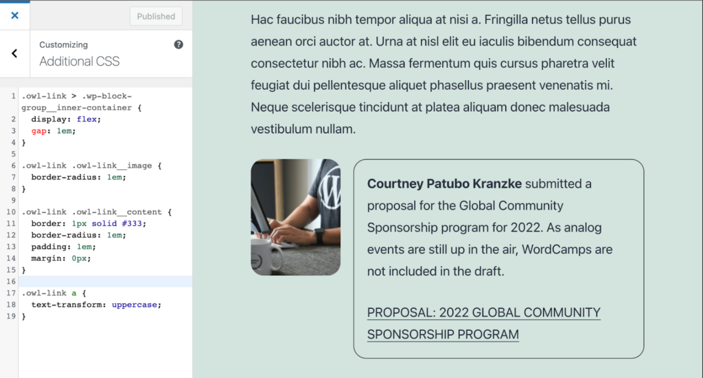
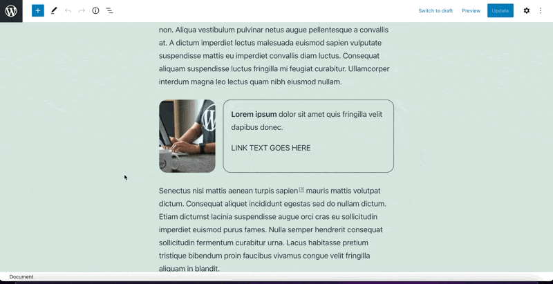
The current version is built using ACF blocks, and it has a few variations, and they look a little bit like this (note that I am using the Dark mode setting).
When is a Block not a Block?
When is a block not a block? When it is built using a block pattern!.
Block patterns are an incredibly powerful feature of Gutenberg. They allow groups of existing blocks to be grouped into a reusable and editable pattern. In many cases, a block pattern can be used instead of the creation of a custom block.
Gutenberg allows you to add custom classes to blocks, so you can take full advantage of CSS within your block patterns to create something that matches the style that you are going for.
My first experiment was to build one of the variations using a block pattern to see how simple this approach might be.
Building the Block Pattern
To keep things simple, I decided to stick with the default WordPress theme (at the time of writing this is the Twenty Twenty-One theme).
Within the Gutenberg editor, I started by creating the following hierarchy of core blocks:
- Group: has a custom class of owl-link applied. It is the main wrapper for the block pattern
- Image: This is the thumbnail for the link and has a class of owl-link__image
- Group: This second group is used to group the content area together, it has a class of owl-link__content
- Paragraph: This is the main content of the link block. You can use the normal paragraph toolbar to apply bold text to the opening of the paragraph.
- Paragraph: This secondary paragraph contains a link (applied via the toolbar)
Applying the Block Pattern
Using the customizer we can add styles to the block pattern we just built, and check that it does everything we need.
It looks like it does the job, so let’s go ahead and make it into a reusable block pattern.
You might notice that we have had to style .wp-block-group__inner-container which we did not add. This is one drawback of using core elements such as the group block, they add additional div’s into the code, which you would not get if you built the block from scratch.
Add the Block Pattern in Code
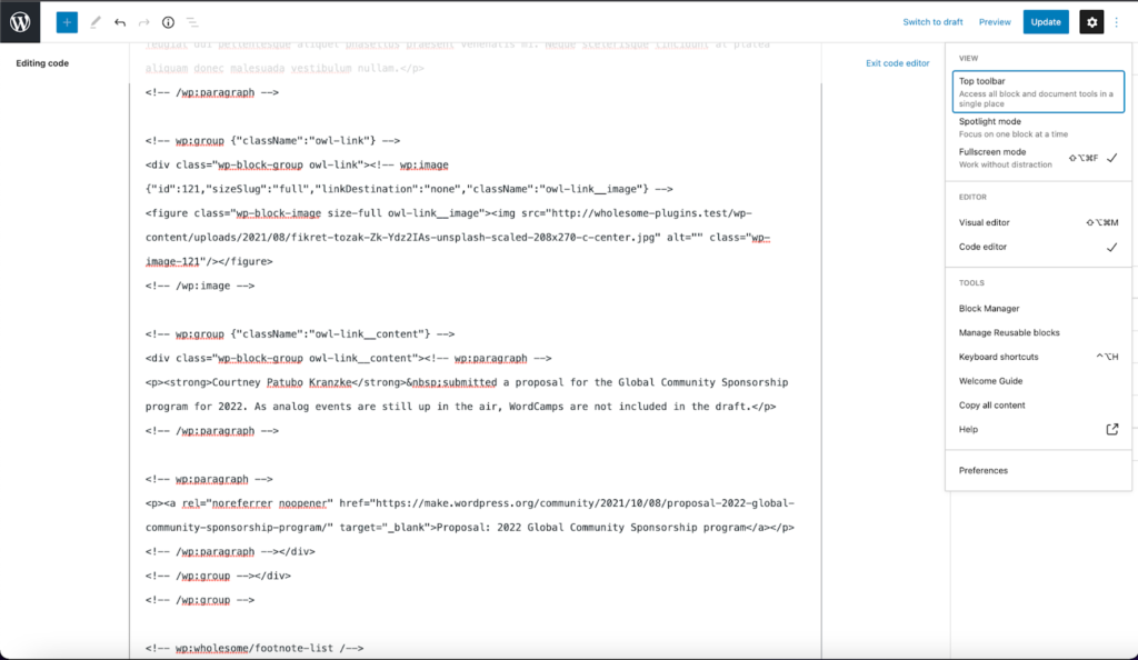
In the top right corner of the Gutenberg block editor, there are three dots stacked vertically, click these and switch the view to ‘Code Editor’.
Once here copy the markup that has been generated for the block pattern you created.
In your favorite code editor, open up the WordPress theme you are using and find the ‘functions.php’ file (you can put the code in other places, but this is the easiest place to begin).
Create a variable called $block_pattern_content and assign it the code you have just copied like in the following code example from this gist.
Note that the image URL will be different in your code.
Add the following code below the above block output:
register_block_pattern(
	'wp-owls/owl-link', // The namespace.
	[
		'categories'    => [
			'Text', // The category the namespace will appear in.
		],
		'content'       => $block_pattern_content, // The content of the block pattern.
		'description'   => 'A link block with thumbnail, description and link',
		'keywords'      => 'owl link', // Words to help find the block pattern via a search.
		'title'         => 'Owl Link - With thumbnail',
		'viewportWidth' => 800, // The width of the block pattern, for the preview area.
	],
);
Go ahead and add the CSS you wrote in the customizer to your themes CSS file (‘style.css’ and also ‘css/style-editor.css’, so that you can view it in the editor. You can remove it from the customizer).
There we have it, you can now use the block pattern.
The code for the Block Pattern, including the CSS, is available in the following Gist.
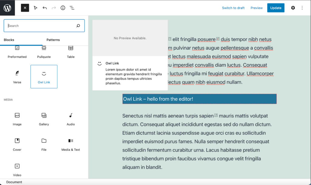
Inserting the Block Pattern
To insert the block pattern click the plus icon in the top left of the block editor, switch to ‘Patterns’ and select the ‘Text’ category (this is the category we used when we registered the block), scroll down and you should see the preview of the block pattern we just created.
Insert the block pattern, change the text, link, and the image, and there you go.
You can now go ahead and create the other owl link variations like this if you choose. But we are not stopping there.
When to use a Block instead of a Block Pattern
If your desired component is simple and can be built out of core elements, a Block Pattern is a quickest and simplest way to go, however even for the most basic of blocks, a Block does have several advantages over a Block Pattern. These are as follows:
- Full control over the output of the block markup
- Ability to add inline attributes (such as microformats for SEO and aria attributes for Accessibility)
- The ability to implement a streamlined custom UI
- You can can build multiple component variations into one block
Creating a Custom Block
To create a custom block we are going to use an npm (Node Package Manager) script created by the WordPress team which will generate all the starter code we need for our block.
The script runs in the command line, and it needs Node.js to be installed.
Once you have it installed, open up your favorite terminal and navigate to the root of your WordPress installations plugin folder, and run the following code:
npm init @wordpress/blockYou will be presented with several questions, this is how I choose to answer them.
- The block slug used for identification (also the plugin and output folder name) — I want my block to be called ‘Owl Link’, so I entered owl-link.
- The internal namespace for the block name (something unique for your products) — As this should be unique for all blocks, I entered wp-owls, as this is who the plugin belongs to.
- The display title for your block — I entered the title of the plugin, Owl Link.
- The short description for your block (optional) — I just entered some lorum ipsum, this can be edited later.
- The dashicon to make it easier to identify your block (optional) — I choose the smiley icon, this can also be changed later.
- The category name to help users browse and discover your block (use arrow keys) — I chose text.
- The name of the plugin author (optional). Multiple authors may be listed using commas — I entered wholesomecode.
- The short name of the plugin’s license (optional) — I pressed enter to accept GPL v2.0 or later.
- A link to the full text of the license (optional) — I pressed enter to insert the GPL v2.0 licence URL.
- The current version number of the plugin — I pressed enter to insert 0.1.0.
Once the plugin has the information it needs it will take a short while to install all the required components. You will then have a folder called owl-link in your ‘plugins’ folder. Use your terminal to change into this directory (cd owl-link) and enter the command npm start so that the plugin will compile all the assets as you start to build your block.
View the Initial Block
Now that your initial block is built, you can go ahead and activate it via the plugins panel in the WordPress dashboard.
Once you have done this you can insert the block into the Gutenberg editor.
At the moment the block doesn’t do much, but the script we ran has done a great job of adding and registering all of the assets we need for our block.
Attributes, base HTML and CSS
Our block is going to need a few attributes to store the data that it needs. Open up the block.json file that is at the root of the plugin, and add the following attributes:
"attributes": {
   "content": {
       "type": "string"
   },
   "imageAlt": {
       "type": "number"
   },
   "imageId": {
       "type": "number"
   },
   "imageUrl": {
       "type": "string"
   },
   "linkText": {
       "type": "string"
   },
   "linkUrl": {
       "type": "string"
   }
}
This gives us somewhere to store the content, the image (and its ID and Alt attributes), and the link text and URL.
Before we start to flesh out the block, I always like to create the block in pure HTML and CSS. Open up edit.js and save.js and replace the automatically generated HTML with the following:
<div {...blockProps}>
     <img src='' alt='' className=''/>
     <div className="owl-link__content">
         <p>
               <strong>Lorem ipsum dolor</strong> sit amet facilisi nulla aliquet massa purus.
         </p>
         <p className="owl-link__link">
             <a rel="noreferrer noopener" href=''>
                 Purus etiam nulla malesuada
             </a>
         </p>
     </div>
 </div>
You can add an image path for testing if you like.
Then delete the contents of your SCSS files and in your style.scss file add some basic CSS to style the block:
.owl-link {
   display: flex;
   gap: 20px;

   .owl-link__image {
       border-radius: 20px;
       height: auto;
       max-width: 25%;
   }

   .owl-link__content {
       border: 1px solid #333;
       border-radius: 20px;
       padding: 20px;
       margin: 0px;
       width: 100%;

       p:first-of-type {
           margin-bottom: 20px;
           margin-top: 0px;
       }

       p:last-of-type {
           margin-bottom: 0px;
       }
   }

   &.is-style-owl-link__no-border {
       .owl-link__content {
           border: none;
           padding: 0px;
       }
   }

   .owl-link__link {
       text-transform: uppercase;
   }
}
If you view the block on the front end now, it should look identical to the block pattern we created.
Making the Block Interactive
At the top of your edit.js file import the following WordPress dependencies.
import { Button, IconButton } from '@wordpress/components';
import { MediaUploadCheck, MediaPlaceholder, RichText, URLInput, URLPopover, useBlockProps } from '@wordpress/block-editor';
import { useState } from '@wordpress/element';
import { __ } from '@wordpress/i18n';
This will give us everything we need to build out the edit screen.
First, let’s replace the edit function with the following:
export default function Edit( { attributes, isSelected, setAttributes } ) {
   const {
       content,
       imageAlt,
       imageId,
       imageUrl,
       linkText,
       linkUrl,
   } = attributes;

   const blockProps = useBlockProps( {
       className: 'owl-link',
   } );

   return (
       <div {...blockProps}>
           { ! imageUrl ? (
           <MediaUploadCheck>
               <MediaPlaceholder
                   icon={ 'format-image' }
                   labels={ {
                       title: __( 'Add Image', 'wp-owls' ),
                       instructions: __( 'Select an image for the Owl Link block', 'wp-owls' ),
                   } }
                   onSelect={ image => {
                       setAttributes({
                           imageAlt: image.alt,
                           imageId: image.id,
                           imageUrl: image.url,
                       });
                   }}
                   accept="image/*"
               />
           </MediaUploadCheck>
           ) : (
           <div className="owl-link__image">
                <img src={ imageUrl } alt={ imageAlt } className={'wp-image-' + imageId} />
           </div>
               }
               </>
           )}
           <div className="owl-link__content">
               <RichText
                   onChange={ content => setAttributes({content})}
                   placeholder={__('Enter content', 'wp-owls')}
                   tagName="p"
                   value={content}
               />
               <p className="owl-link__link">
                   <RichText
                       formattingControls={[]}
                       onChange={linkText => setAttributes({linkText})}
                       placeholder={__('Enter Link Text', 'wp-owls')}
                       tagName="span"
                       value={linkText}
                   />
               </p>
           </div>
       </div>
   );
}
Let’s take a look at what we just did.
The Image
We replaced our image with a MediaPlaceholder component, surrounded by a MediaUploadCheck wrapper.
The MediaPlaceholder component lets us choose an image, and the MediaUploadCheck ensures that we have permission to do that.
This in turn is wrapped with a ternary if statement that determines if the imageUrl has been set, and if it has, the component will instead show the image.
The Content
We have replaced the inner content of the content p tag with a RichText component. This will let us dynamically add content text into the block.
The Link Text
As per the content p tag, we have done the same with the link, however does not set the link itself, this is something we will address next.
Add the Image URL Button
We are going to create a popover for the link. To do this we need to support something called ‘state’. The state keeps track of changes in your component and allows actions to be fired based on what it is set to.
More recent changes to Gutenberg make it easier than ever to use state, just add the following code to the top of your edit function:
const [ showURLPopover, setPopover ] = useState( false );
Then under the link text p tag add the following code:
{isSelected && (
   <IconButton
       className="owl-link__link-button"
       icon={'admin-links'}
       onClick={ () => setPopover( true ) }
   >
       { isSelected && showURLPopover && (
           <URLPopover
               onClose={ () => setPopover( false ) }
           >
               <form
                   className="block-editor-url-popover__link-editor"
                   onSubmit={ ( event ) => {
                       event.preventDefault();
                       setPopover( false );
                   } } >
                   <div className="editor-url-input block-editor-url-input">
                       <URLInput
                           value={ linkUrl }
                           onChange={linkUrl => setAttributes({linkUrl})}
                           placeholder={ __( 'Enter Url', 'wp-owls' ) }
                       />
                   </div>
                   <IconButton icon="editor-break" label={ __( 'Apply', 'wp-owls' ) } type="submit" />
               </form>
           </URLPopover>
       ) }
   </IconButton>
)}
What this code does is enables a button that shows only if the block is selected, and if the button is clicked a URL Popover component is shown allowing you to enter a link (it also supports typeahead for links within your site).
When we click the link button the state is set to true, and when we have finished setting the link the state is set to false.
Additional Logic (Show/Hide)
We are almost done, but that “hide the element unless we select it” logic we just implemented is really handy. Lets update our function to take advantage of that.
We also could do with a button to remove the image if we have set it.
Update your edit.js file to use the following code:
import { Button, IconButton } from '@wordpress/components';
import { MediaUploadCheck, MediaPlaceholder, RichText, URLInput, URLPopover, useBlockProps } from '@wordpress/block-editor';
import { useState } from '@wordpress/element';
import { __ } from '@wordpress/i18n';

import './editor.scss';

export default function Edit( { attributes, isSelected, setAttributes } ) {
   const [ showURLPopover, setPopover ] = useState( false );

   const {
       content,
       imageAlt,
       imageId,
       imageUrl,
       linkText,
       linkUrl,
   } = attributes;

   const blockProps = useBlockProps( {
       className: 'owl-link',
   } );

   return (
       <div {...blockProps}>
           { isSelected && ! imageUrl ? (
           <MediaUploadCheck>
               <MediaPlaceholder
                   icon={ 'format-image' }
                   labels={ {
                       title: __( 'Add Image', 'wp-owls' ),
                       instructions: __( 'Select an image for the Owl Link block', 'wp-owls' ),
                   } }
                   onSelect={ image => {
                       setAttributes({
                           imageAlt: image.alt,
                           imageId: image.id,
                           imageUrl: image.url,
                       });
                   }}
                   accept="image/*"
               />
           </MediaUploadCheck>
           ) : (
               <>
               { imageUrl &&
                   <div className="owl-link__image">
                       <img src={ imageUrl } alt={ imageAlt } className={'wp-image-' + imageId} />
                       { isSelected &&
                           <Button
                               className="owl-link__image-remove"
                               isDestructive
                               label={ __( 'Remove Image', 'wp-owls' ) }
                               onClick={ image => {
                                   setAttributes({
                                       imageAlt: '',
                                       imageId: '',
                                       imageUrl: '',
                                   });
                               }}
                           >
                               { __( 'Remove Image', 'wp-owls' ) }
                           </Button>
                       }
                   </div>
               }
               </>
           )}
           <div className="owl-link__content">
               <RichText
                   onChange={ content => setAttributes({content})}
                   placeholder={__('Enter content', 'wp-owls')}
                   tagName="p"
                   value={content}
               />
               <p className="owl-link__link">
                   <RichText
                       formattingControls={[]}
                       onChange={linkText => setAttributes({linkText})}
                       placeholder={__('Enter Link Text', 'wp-owls')}
                       tagName="span"
                       value={linkText}
                   />
                   </p>
                   {isSelected && (
                       <IconButton
                           className="owl-link__link-button"
                           icon={'admin-links'}
                           onClick={ () => setPopover( true ) }
                       >
                           { isSelected && showURLPopover && (
                               <URLPopover
                                   onClose={ () => setPopover( false ) }
                               >
                                   <form
                                       className="block-editor-url-popover__link-editor"
                                       onSubmit={ ( event ) => {
                                           event.preventDefault();
                                           setPopover( false );
                                       } } >
                                       <div className="editor-url-input block-editor-url-input">
                                           <URLInput
                                               value={ linkUrl }
                                               onChange={linkUrl => setAttributes({linkUrl})}
                                               placeholder={ __( 'Enter Url', 'wp-owls' ) }
                                           />
                                       </div>
                                       <IconButton icon="editor-break" label={ __( 'Apply', 'wp-owls' ) } type="submit" />
                                   </form>
                               </URLPopover>
                           ) }
                       </IconButton>
                   )}
           </div>
       </div>
   );
}
Almost there, we just need a few styles added to our editor.scss file so everything renders nicely:
.owl-link {
   .block-editor-media-placeholder {
       border-radius: 20px;
       max-width: 25%;

       .dashicon {
           margin-right: 6px;
       }
   }

   .owl-link__image {
       overflow: hidden;
       position: relative;

       img {
           border-radius: 20px;
       }

       .owl-link__image-remove {
           background-color: #ffffff;
           border-top-left-radius: 20px;
           left: 0px;
           position: absolute;
           top: 0px;
       }
   }

   .owl-link__link-button {
       bottom: 20px;
       position: absolute;
       right: 20px;
   }
}
And there we have it, the editor is now fully wired up.
Frontend Logic
Notice how if we didn’t have an image set, the thumbnail didn’t render. Without really trying we have created two of the three-block variations that we set out to create.
Let’s make sure we alter the logic in the save.js file so that happens on the frontend too.
import { RichText, useBlockProps } from '@wordpress/block-editor';
import { __ } from '@wordpress/i18n';

export default function save( { attributes } ) {
   const {
       content,
       imageAlt,
       imageId,
       imageUrl,
       linkText,
       linkUrl,
   } = attributes;

   const blockProps = useBlockProps.save( {
       className: 'owl-link',
   } );

   return (
       <div {...blockProps}>
           { imageUrl &&
               <img src={imageUrl} alt={imageAlt} className={'owl-link__image wp-image-' + imageId}/>
           }
           <div className="owl-link__content">
               <p><RichText.Content value={content}/></p>
               <p className="owl-link__link">
                   <a rel="noreferrer noopener" href={linkUrl}>
                       {linkText}
                   </a>
               </p>
           </div>
       </div>
   );
}
Now the output of the block we just created in the Gutenberg editor will be the same on the frontend of the site too.
Block Styles
Remember how we have created two of the three variations so far, let’s make that third.
Update your block.json file so that it includes the styles section:
"styles": [
   {
       "name": "owl-link__border",
       "label": "Border",
       "isDefault": "true"
   },
   {
       "name": "owl-link__no-border",
       "label": "No Border"

   }
],
If we use the Gutenberg editor we can now choose between the styles of border and no border. We have already accommodated this in our CSS with the .is-style-owl-link__no-border class. This class is automatically appended to our block when we choose our style.
To use the styles simply choose the style directly from the Gutenberg block editor like so:
LearnDash is taking cutting-edge e-learning methodology and infusing it into WordPress. Trusted to power the learning programs for major universities, small to mid-size companies, startups, entrepreneurs, and bloggers worldwide.
In Conclusion
Although it is very easy to implement your components with a Block Pattern, a little bit of extra work to create a custom Block can solve multiple problems in a simple to use interface. There are pros and cons to each.
This guide only touches on some of the available functionality. You could implement a sidebar, or a toolbar to make adding your links and images even easier.
You can download the full code for the “Owl Link” block here: https://github.com/wholesomecode/wp-owls-owl-link
Happy coding, I cannot wait to see what you build.

Author: Matt Watson
I’m Matt Watson. I can usually be found over at Wholesome Code tinkering with the WordPress Block Editor (Gutenberg).